"Data, data, data. I cannot make bricks without clay."
- Sherlock Holmes (2009)
If components are the bricks of our app, data would certainly be some of the clay in that analogy.
The interpolation we saw earlier is just one way of binding data. The easiest. There are at least three more ways to bind data. Let's find out what they are.
1. Event Binding:
Let's add a button to our template:
kick-ass.component.html
<p>
    {{getProfile()}}
</p>
<button> Hit Me </button>
Now, we obviously want the button to do something when it's clicked. Say we want to call a method named gotHit.The way you do it is this:
...
<button (click)="gotHit()"> Hit Me </button>
On the left hand side, you've got your event name in parans. On the right, you have your code inside quotes. Just like the interpolation syntax we saw earlier, the stuff inside the code gets evaluated; in this case, whenever the button is clicked. That means, your gotHitmethod is called.
You can add a gotHit method to your ts file to test:
kick-ass.component.ts
...
    gotHit() {
        alert('You hit like a vegetarian')
    }
...
Now, whenever you click your button, you should see an alert.
2. Property binding:
Let's move on to see how property binding works.
Add another button -- 'Hit me Again' -- and bind it to the event gotHitAgain()
So we have:
kick-ass.component.html
...
<button (click)="gotHit()"> Hit Me </button>
<br>
<br>
<button (click)="gotHitAgain()"> Hit Me Again </button>
kick-ass.component.ts
...
    gotHitAgain() {
        alert('That was good!');
    }

...
Now. We only want to enable the second button after the first button has been clicked.
The way to do that is to bind the disabled property of the button. If we bind it to a boolean value; angular will always set it to that value. Even when it changes.
Define a boolean isReady in your code and initialise it to `true`. (So as to disable the button initially)
Make it false only after the first click happens.
kick-ass.component.ts
...
    alias: string;
    age: number;
    name: string;
    isReady: boolean = true;

...
    gotHit() {
        alert('You hit like a vegetarian');
        this.isReady = false;
    }
...
kick-ass.component.html
...
<button [disabled]="isReady" (click)="gotHitAgain()"> Hit Me Again </button>
The syntax is very similar. The property name inside square brackets and the variable inside quotes. Keep in mind that the stuff inside the quotes is evaluated.
Now. Your property is bound. Your page should initially look like this:
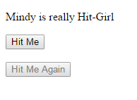
Take a moment to appreciate this. disabled is a boolean attribute in HTML. That means that in plain HTML, its presence alone, regardless of its value, would disable the button. Stuff like <button disabled='false'>won't work. You have to completely remove the attribute to make it work.
In our case, it's Angular magic under the hood that's making it work.
The use case we just saw was binding standard attributes to standard HTML tags. The same exact syntax can be used to bind custom attributes to tags of custom components; provided you have defined said attributes in your component.
So it could look something like:
<my-own-component [customAttribute]="someVariableIveDeclared"></my-own-component>
More on that when we actually build some more components and try to get them to talk.
2a. Style and class binding:
Let's kick things up a notch. Angular has several syntax shortcuts in place for frequently encountered use-cases. Two of such cases are toggling a single style in an element; and toggling an entire class.
Let's say we want our text to be navy blue before and red after the first hit. We already have the boolean isReady we could use.
The code we'll write matches the ternary operator syntax in js.
<p [style.color]="isReady ? 'navy' : 'red'">
On the left-hand side, we have the style property followed by a dot and the name of the style we want to change: color. On the right hand side, we have our boolean as the 'condition' part of our operator; followed by the two style values we want to be applied. The first one, navy is for when the boolean is true. The second, red is for when it's false. Note that these values are strings, ergo, they need their own quotes.
We can also try changing font-sizes:
<p [style.font-size.px]="isReady ? 12 : 24">
This time, you don't need quotes around your values, as they're numbers. However, you do need to specify the font-size unit in the left hand size. Also note that style names like font-size are usually written in dash-case, but camelCase is also acceptable here.
You get the idea.
Class binding is even simpler. No need of any ternary operators. You just specify a class. If the boolean is true, the class is added. If and when it's false, the class is removed.
Let's add a class called afterFirstHit to our first button; to be applied after the first hit. The boolean we need in this case would be the opposite of isReady since we need it to return false initially.
Our button is now:
<button [class.afterFirstHit]="!isReady" (click)="gotHit()"> Hit Me </button>
And we can add the class in the .css file Angular CLI was kind enough to create and wire for us:
kick-ass.component.css
.afterFirstHit{
    background-color: crimson;
    color: royalbule;
    height: 50px;
}
Now, after the first click, you should see these styles being applied to your button.
To modify more than one style/class, you'll need to use the built-in attribute directives
ngClassandngStyle. Since this is not that frequent a use case in my experience, I'll leave this as an exercise. You can read about them here.
Just to drive the point home one more time: take a moment to appreciate how much easier this data biding has made our life. The boolean is changing only once currently, but it could change as many times as it cares; the changes will still happen. This isn't a one-time deal. The property and the data are married for life. Once the data is bound; the property will behave as configured. You don't have to write anything extra to make it work.
The third and final trick is two-way binding. It's the coolest one. And kind of Angular's specialty.
We'll see that in a future chapter when we work with forms. At that time we'll also look into the third built-in directive: ngModel. Until then, just think of it as a combination of both event and property binding.
Click here to open a plunker with a live demo of what we've done in this section.
(There are slight differences in the setup structure and paths owing to the way plunker works; but the functionality is the same.)