"I'm gonna make some weird shit."
- Guardians of the Galaxy, vol. 2 (2017)
I didn't think it would be this long before we started coding. Well. We're here now.
Let's create an entirely new component and familiarize ourselves with the weird angular syntax.
Open a terminal at ../src/app and type:
ng generate component kick-ass
Note: The component name is specified in kebab-case above. Even if you use camelCase, CLI will automatically convert it to kebab-case in accordance with the style guide.
You'll see that CLI has created a folder called kick-ass which houses your component. It contains 4 files. To reiterate, the .ts file has your code. The .html and .css have your template and styles. The .spec.ts file has your karma unit test cases, which we're gonna ignore for now.
Let's inspect kick-ass.component.ts:
import { Component, OnInit } from '@angular/core';

@Component({
  selector: 'app-kick-ass',
  templateUrl: './kick-ass.component.html',
  styleUrls: ['./kick-ass.component.css']
})
export class KickAssComponent implements OnInit {

  constructor() { }

  ngOnInit() {
  }

}
Your component is a class, with an empty constructor and empty ngOnInit() method thrown in. We're gonna see what those are for in a moment.
The major information here is inside the @Component decorator (anything you see preceded by an @ is a decorator in Angular jargon). The metadata has the following properties:
- Selector: The tag name your custom component will hereafter be known by. Angular recommends giving it a prefix. CLI gives it the prefix
app-by default. You can tweak this, but more on that later. templateUrl: The address pointing to the corresponding html file. Since it's parallel, we use the
./notation. But it could technically be anywhere in your codebase.- Alternatively, you could have the template property containing the actual html instead of an address. This only makes sense for extremely small templates, which are uncommon.
styleUrls: An array of addresses pointing to the stylesheets this component uses. Currently it just has the one entry.
- Alternatively, you could have the styles property containing the actual styles instead of addresses. Again, this only makes sense for very small stylesheets.
The one other property used extensively is providers. As we saw in app.module, it's an array that holds the services the component and its children use.
For a more extensive list, see the docs.
Now that we have our component, how do we use it.
The stuff inside the selector serves as our tagname. To include this component, create tags where you want it.
Since we only have one other component at the moment, let's put it there.
Open app.component.html, which currently looks like:
<h1>
  {{title}}
</h1>
The weird thing inside the h1 tag already looks foreign. But let's put a pin in that for now.
Below the h1 (or above it, wherever), add your new tags, so your file looks like:
<h1>
  {{title}}
</h1>
<app-kick-ass></app-kick-ass>
Your new component should be visible in the right place:
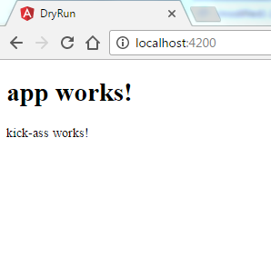
Since we're only working with two components, it's a little hard to appreciate this. But you can stick the opening and closing tag pretty much anywhere across your codebase and Angular will replace it. Pretty sweet.
Speaking of pretty, let's get rid of that ugly header and give our comp a makeover. Head to the next chapter to see how the html and ts files talk.